Interact With Your Reports
For Healthcare Providers
Introducing the Chart Card
This is the Chart Card. It shows you everything you need to know about your and your peers', in several different ways.
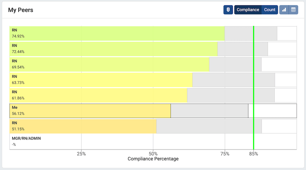
You may notice a few things you may notice when looking at this chart. First, at the top, we can see that this chart is currently showing Compliance. The percentages below each staff's label is their full compliance score. As that staff member's bar approaches the hospital compliance goal (here, 85%), it turns more green. Above the staff's colored full-compliance bar is also a gray bar, showing partial compliance, and a white bar, showing non-compliance. In the top-right of the Chart Card is a toolbar with several controls.
The Chart Card Toolbar
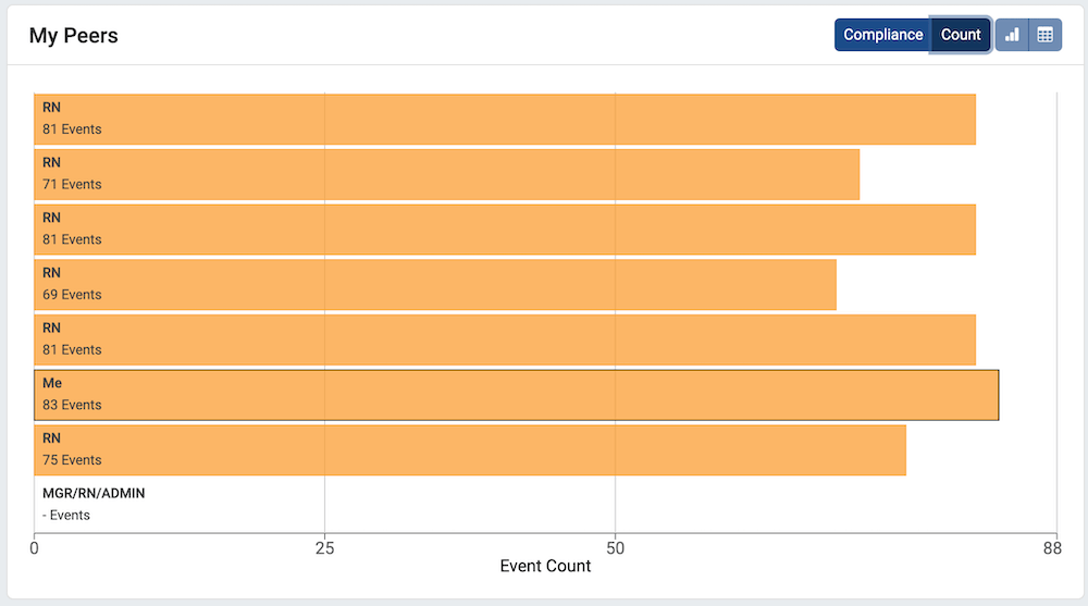
Compliance and Count
On the left side of the toolbar, you can select between two different data sources:
- Compliance shows the percentage of Full Compliance hygiene events
- Count shows the number of hygiene events
Your chart will change to reflect the data source selected. Here, Count is selected instead of the default Compliance.
Additional Options in the Toolbar
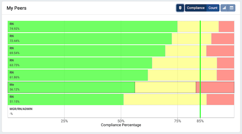
Traffic Light Colors
When Compliance is selected, a button with a traffic light appears in the toolbar. Clicking on this button toggles between standard colors and Traffic Light Colors. With Traffic Light Colors enabled, Full Compliance is always green, Partial Compliance is always yellow, and Non-Compliance is always red.
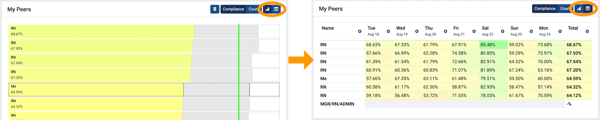
The Table View in "Last Week"
When more than one day of data is available, as in "Last Week", the Table View Toggle (circled below) becomes enabled at the right side of the toolbar. Clicking on the table icon on the right switches the Bar Chart to Table View.
In table view, the same data is available, but now with individual component days shown in each column.
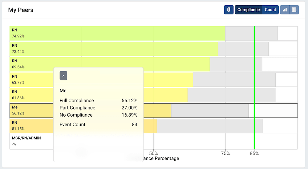
Clicking a Row for More Information
The Tooltip
Clicking on a bar in Bar Chart view or a row in Table View brings up a tooltip, showing detailed information on compliance and event counts.